How to assess data visualizations

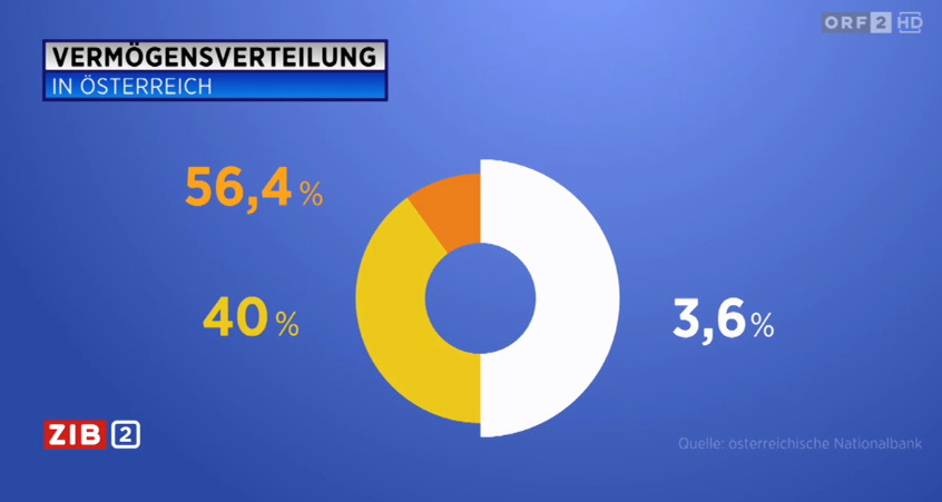
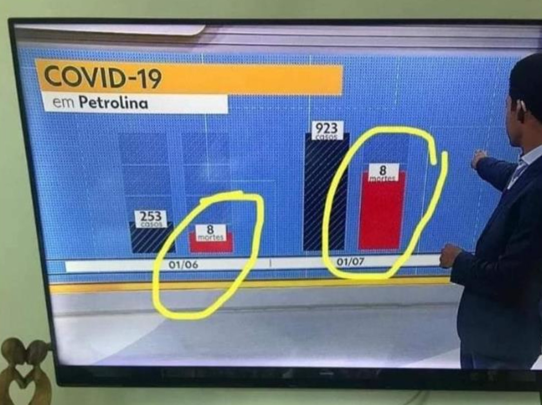
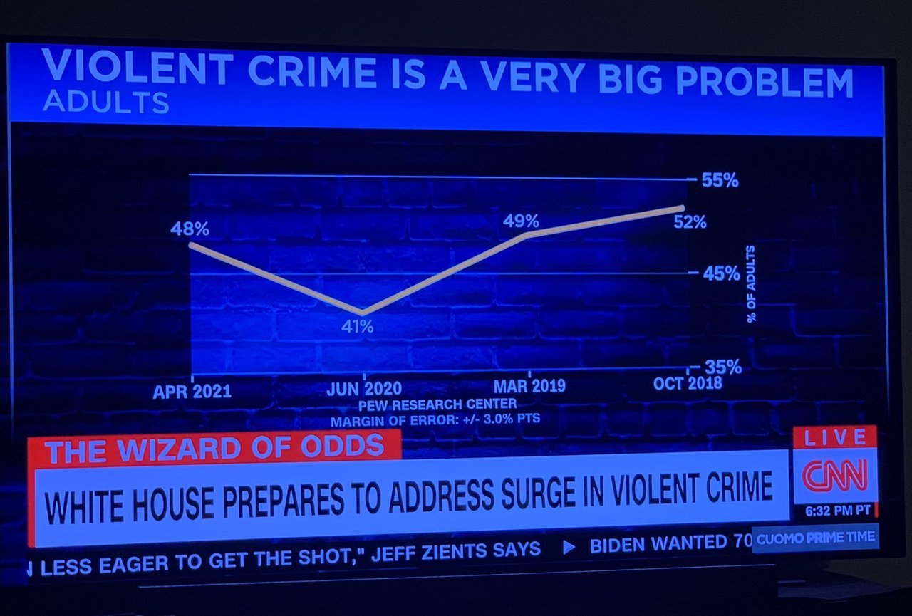

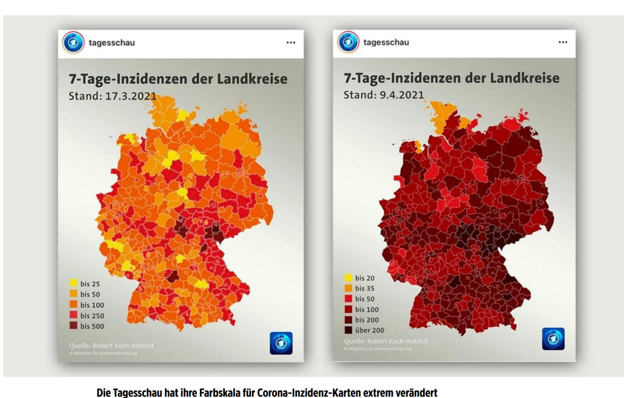
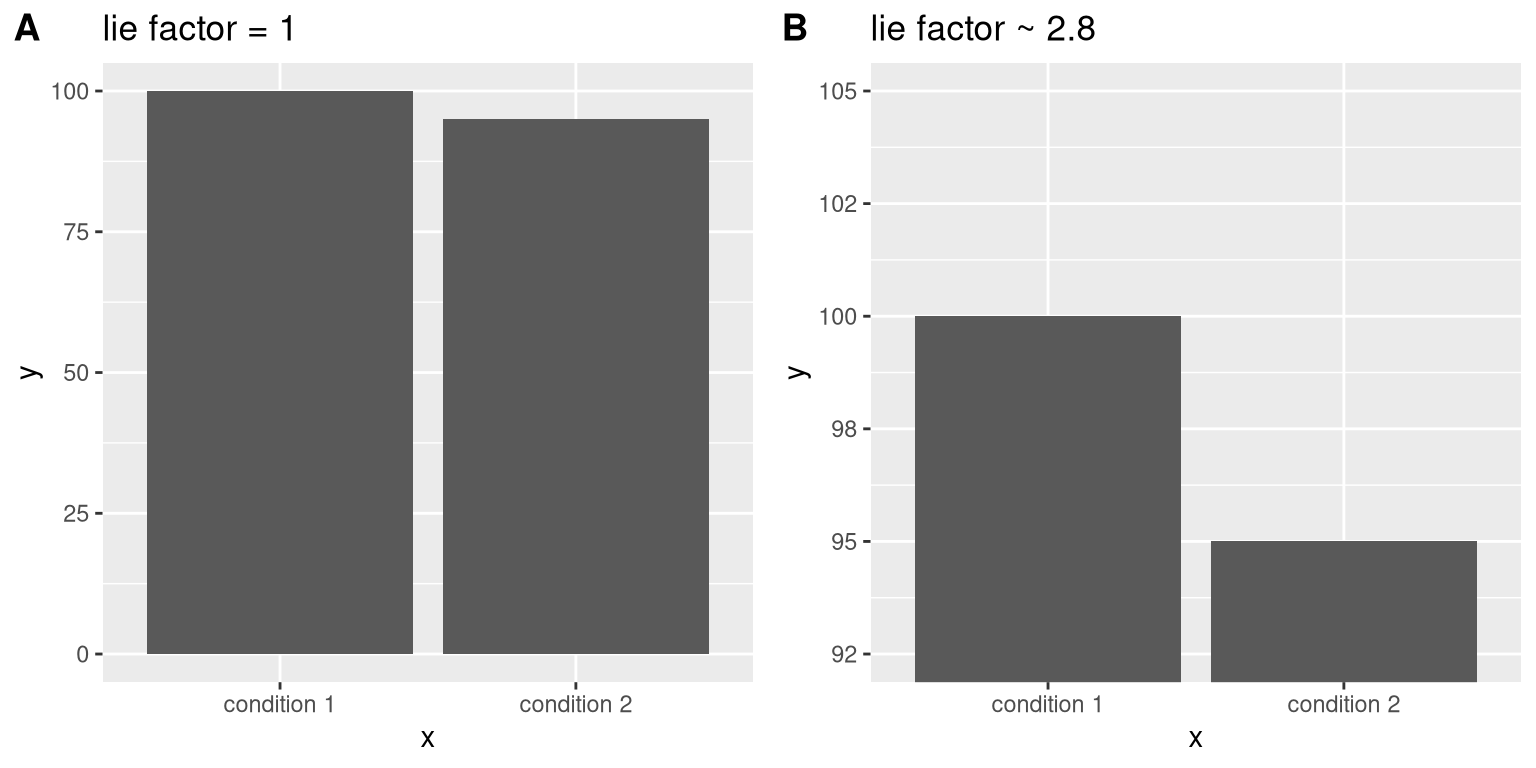
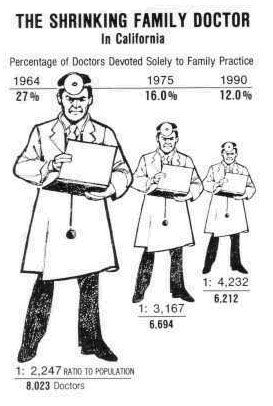
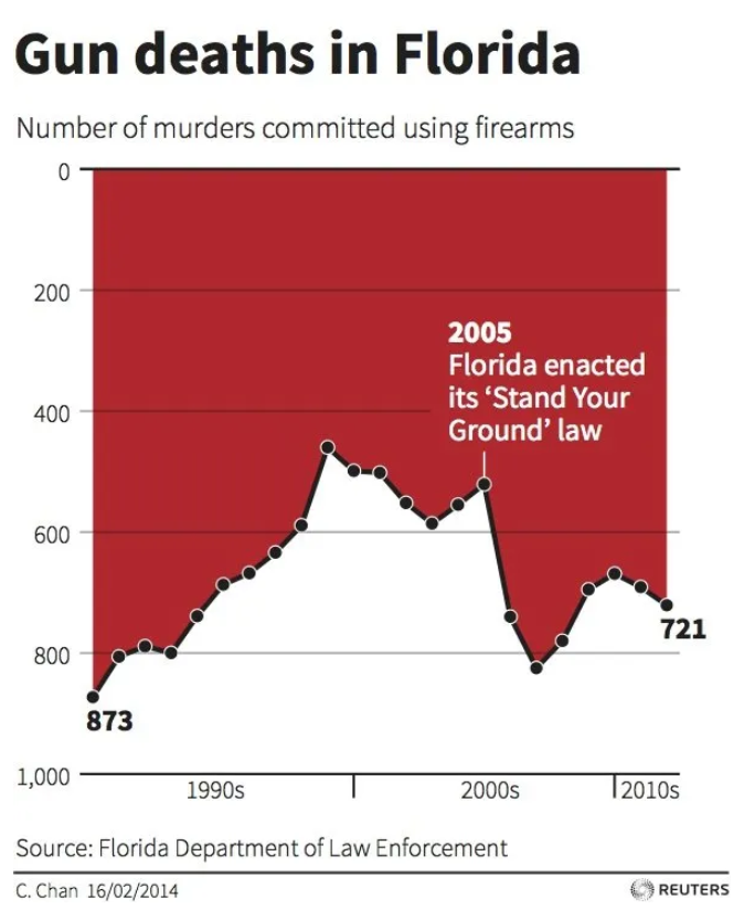
The Lie factor
But…
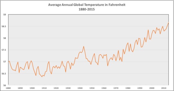
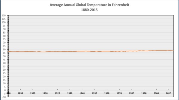
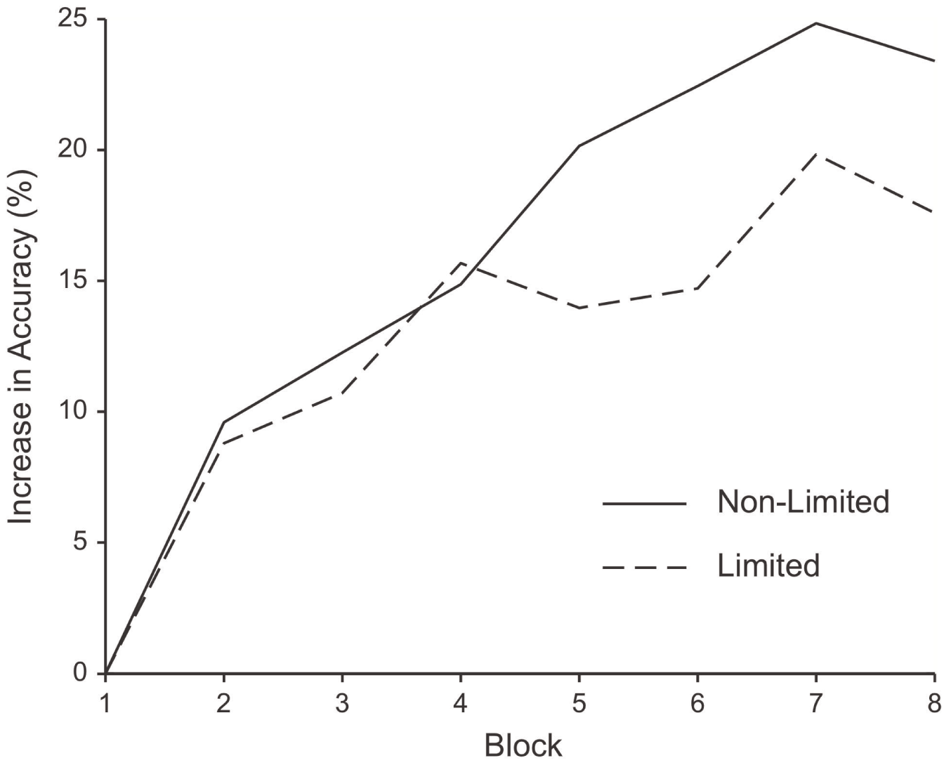
Fig 1. Mean percentage of correct answers (panel a) and mean reaction times in correct trials (panel b) as a function of training session (S1, S2, S3, S4, S5) and group (younger adults, older adults). Bars indicate the standard error of the mean.


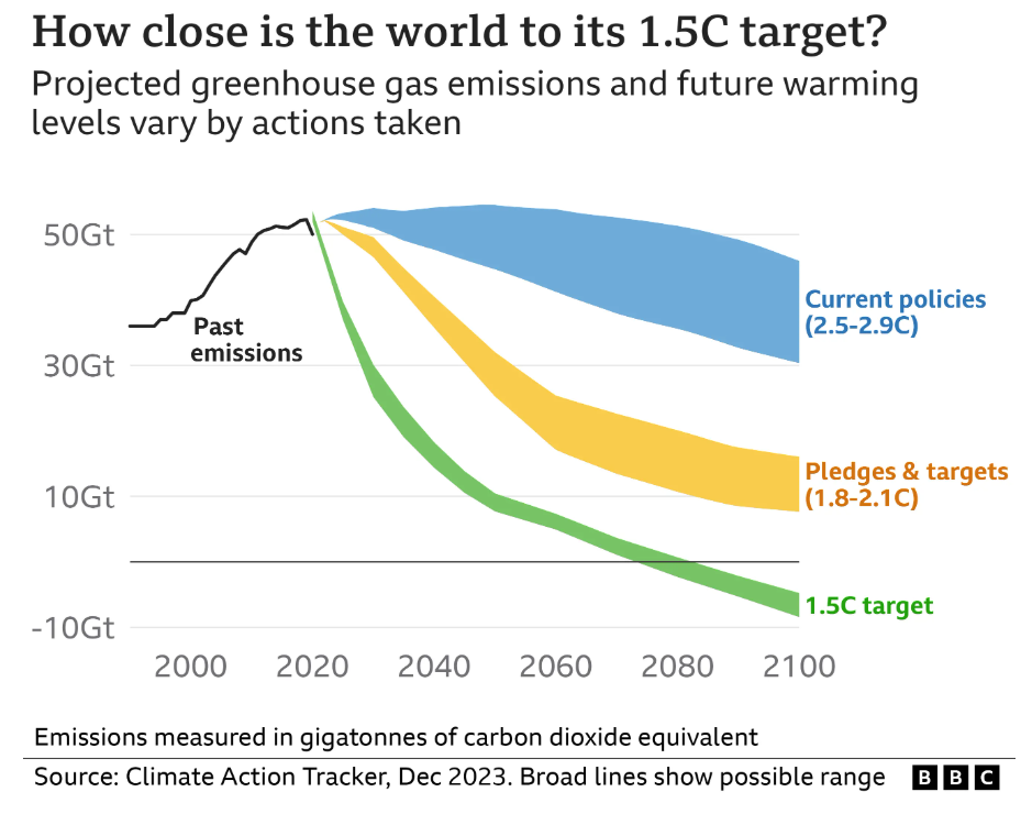
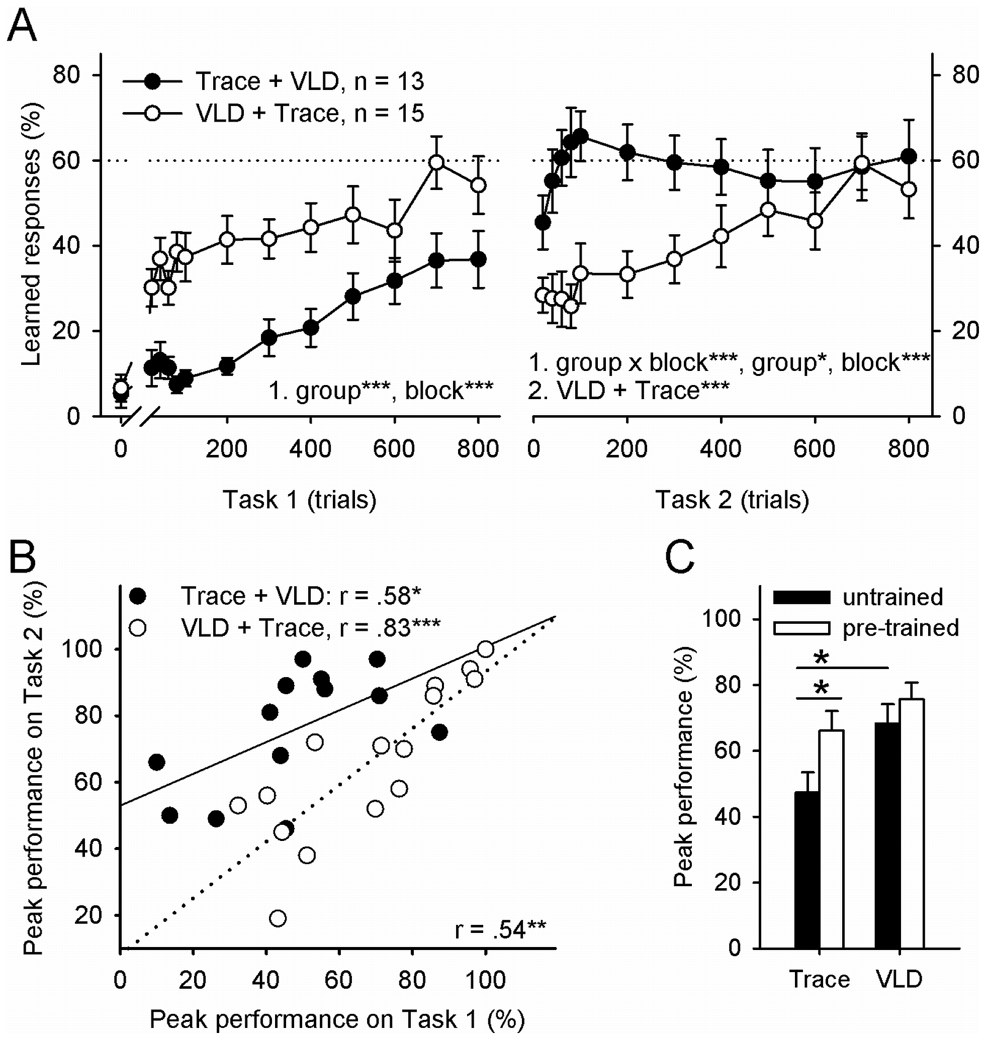
Figure 2. Learning was facilitated and predicted by previous learning of a similar task and very-long delay (VLD) conditioning was easier to learn than trace conditioning.
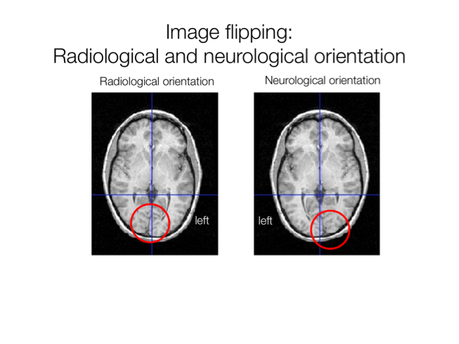
Conventions may be audience specific!

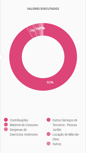
3D pie chart example
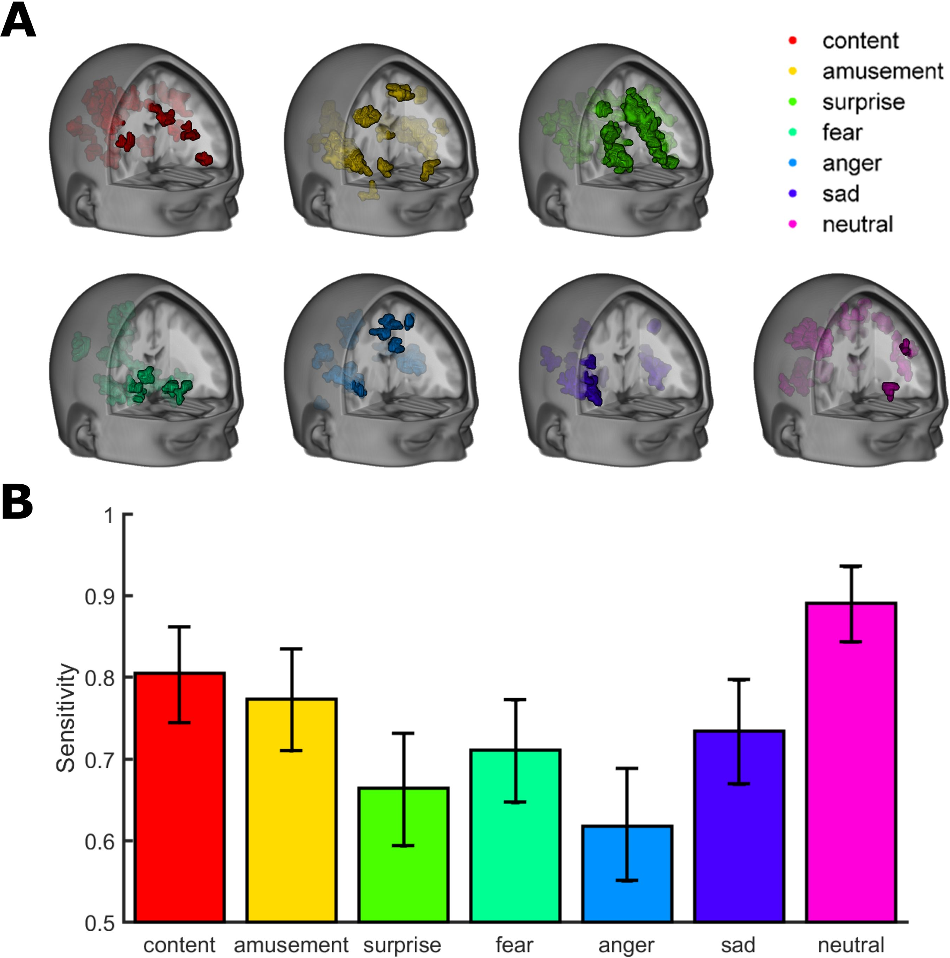
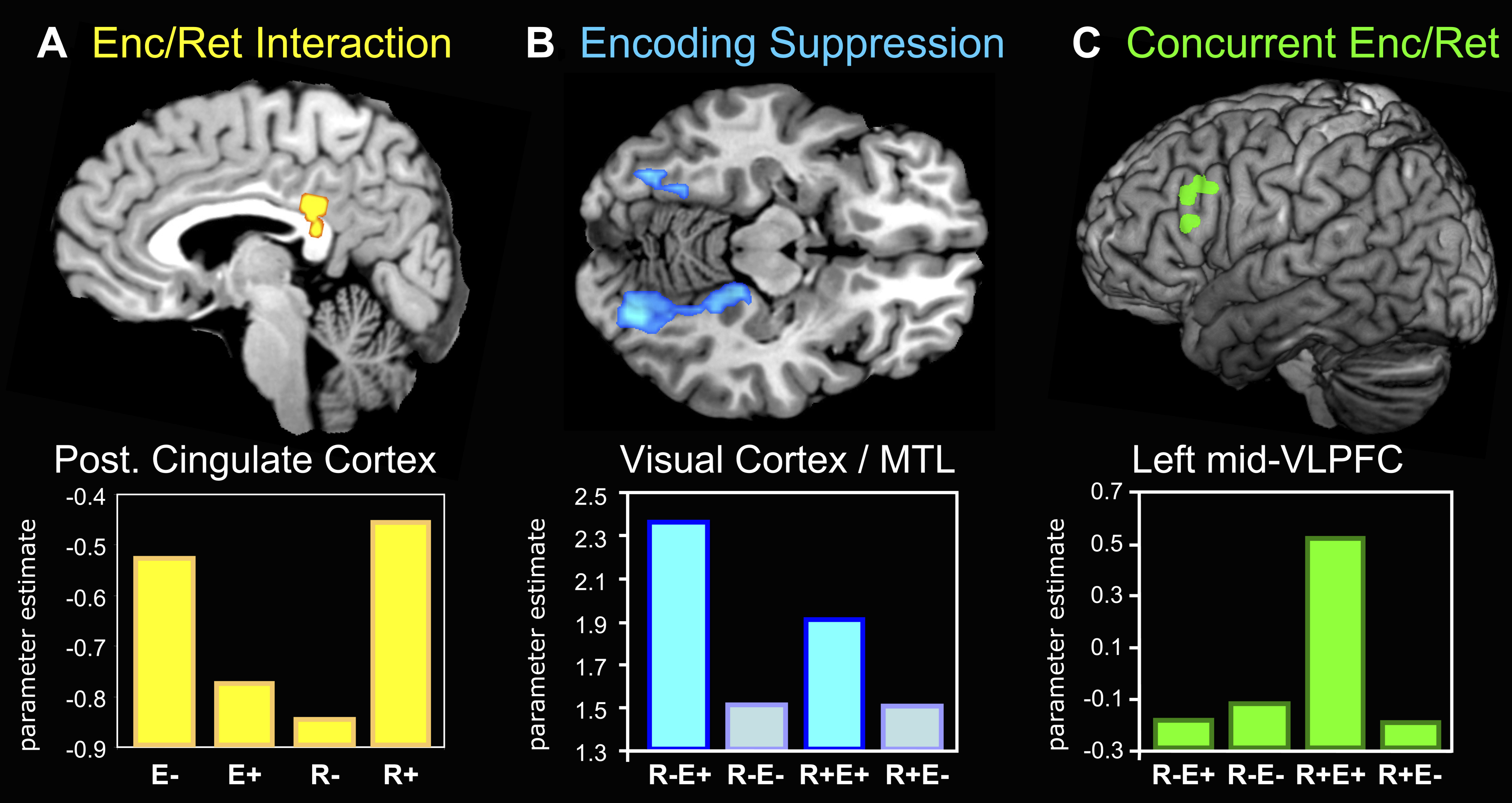
Figure 3. fMRI Results. Hujibers et al. (2009) — Source: https://journals.plos.org
