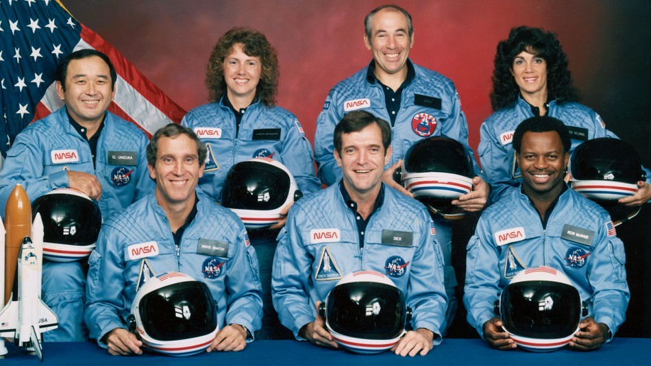
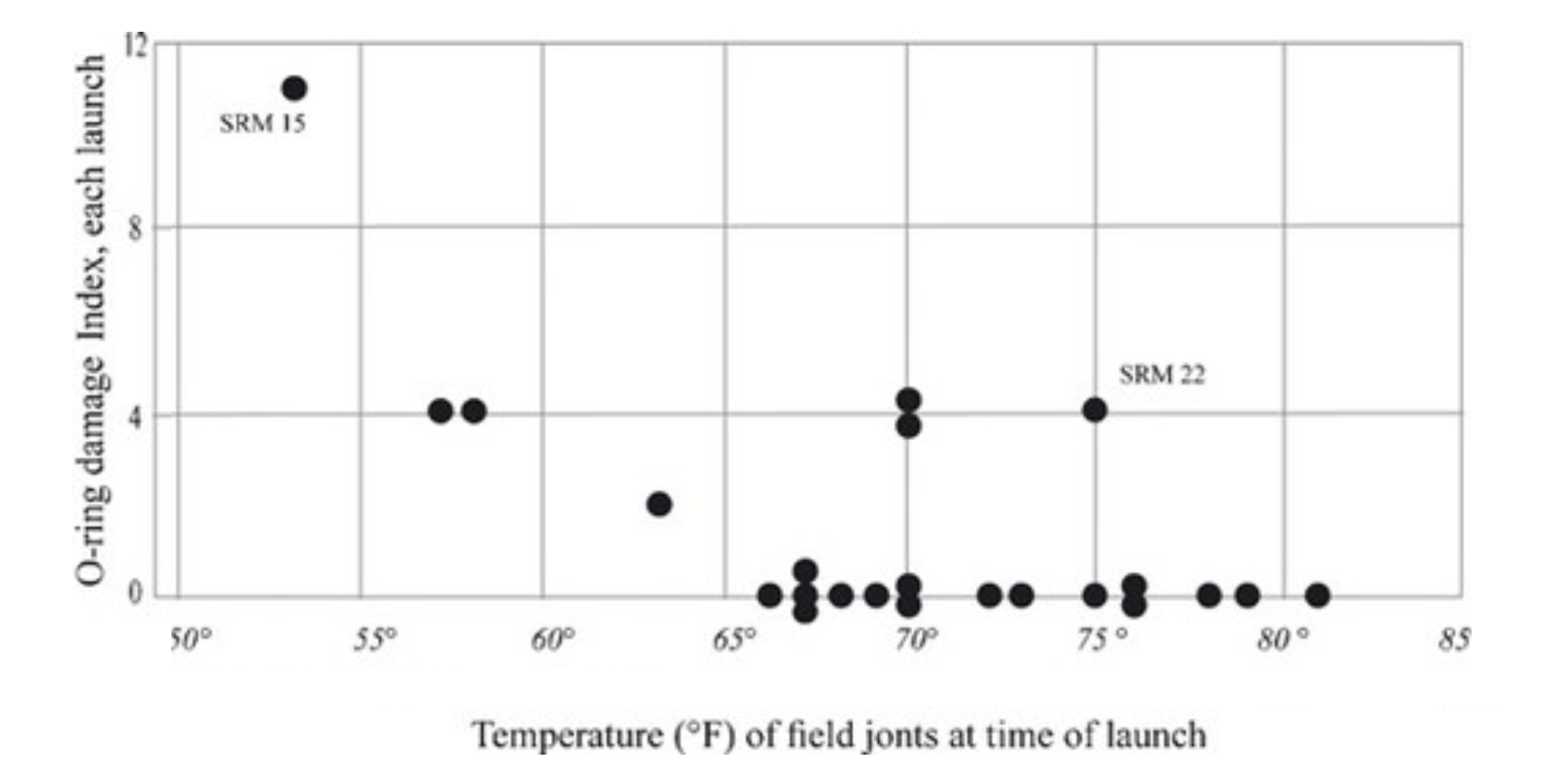
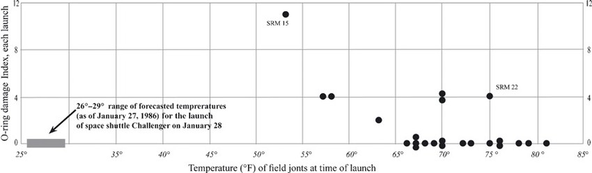
The night before…
What’s the issue?
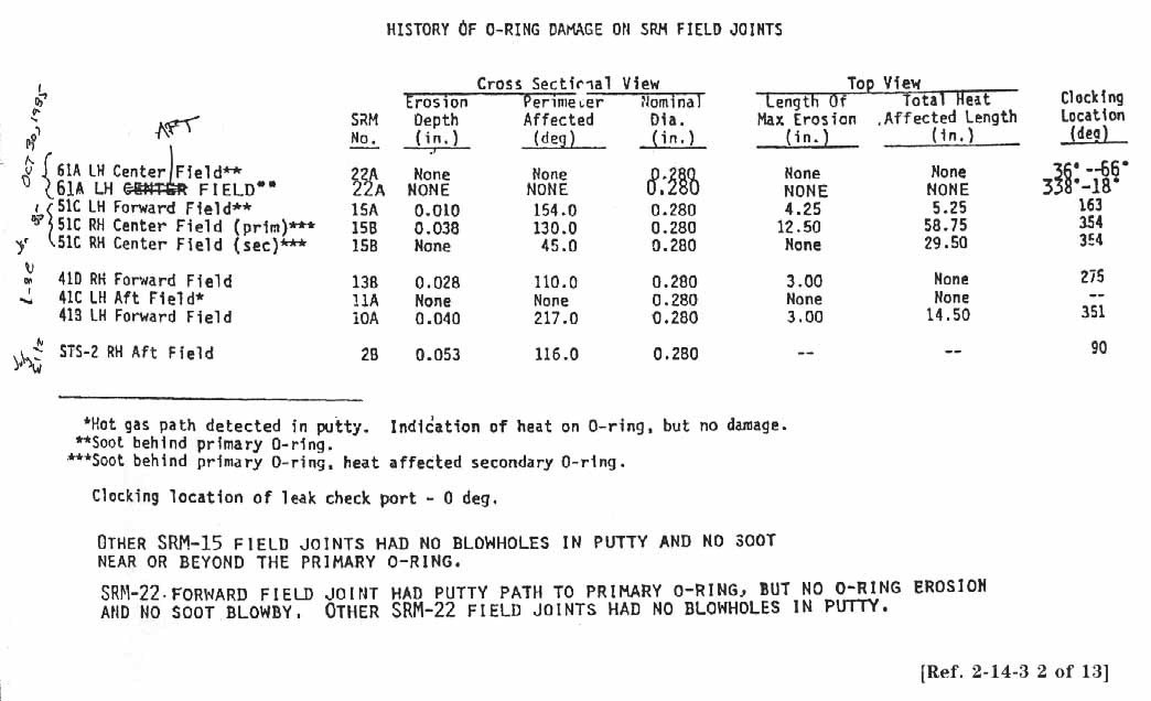
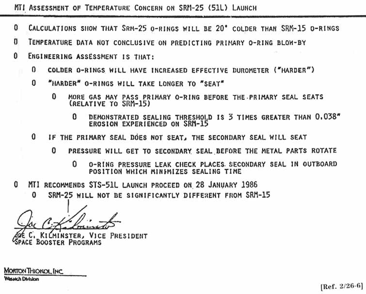
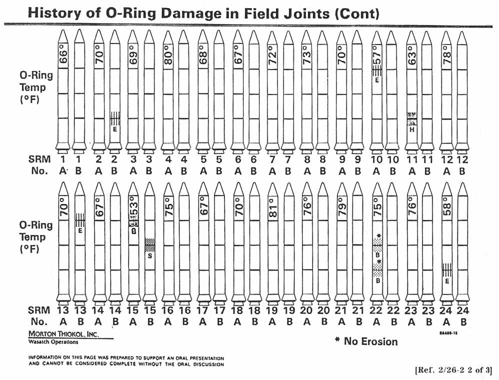
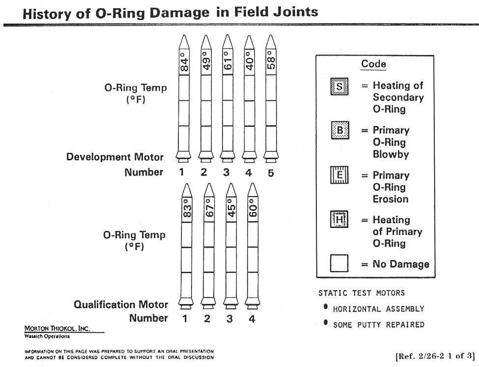
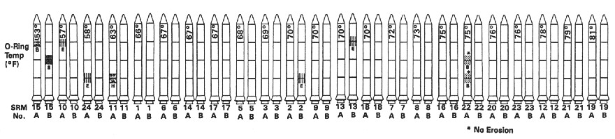
O-rings
might get damaged
when it’s too cold.
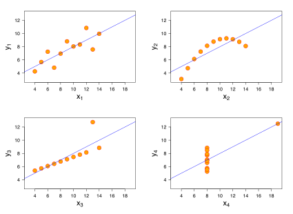
What can you say about these four datasets?
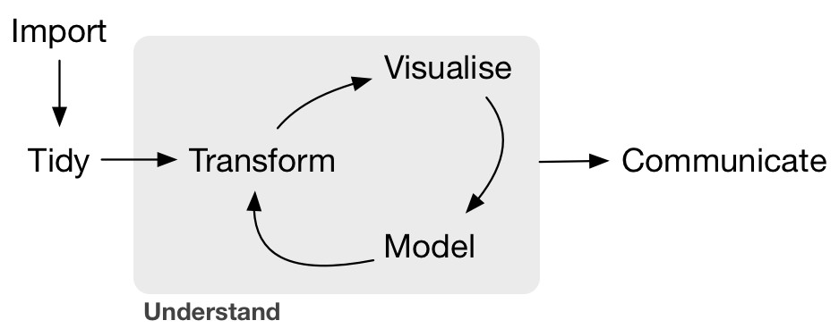
The data science workflow
The two reasons for visualizing data
Two “types” of visualizing data
Exploration
iterate fast
check and recheck
Explanation
deliberate, purposeful
specific, perfect
Beyond informing…

Make it personal.
Resources